THIRDWAY X NBA:
BRAND INTEGRATION
While working at Thirdway, we were presented with the chance to pitch for the design and build of NBA London’s new office.
As a massive fan of the NBA and a longtime viewer, this was a dream project to work on. The NBA’s brand is universal, respected and unwavering. The deep brand messaging is clear with passion and conviction interwoven in everything they do. With a global presence and following, it’s paramount that this space reflects the brand in its truest form.
My contribution to this project included art direction of all our submissions, proposals and pitches, working closely with the interior designer to implement brand integration into our design. I also pitched the branding segment of our proposal to the NBA team at their current Shaftesbury Avenue location, explaining how the brand would work in cohesion with the interior design.
Tools Used:
Adobe After Effects, Adobe Photoshop, Adobe InDesign, Adobe illustrator
Contribution:
Branding / Art Direction / Pitch Deck Design / Animation
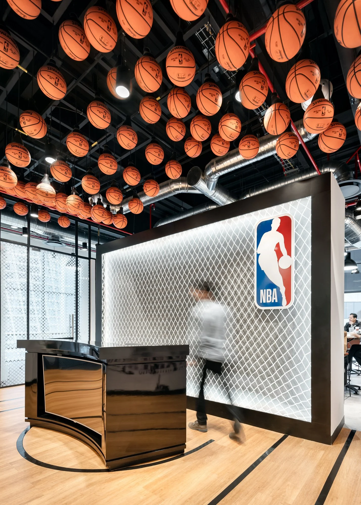
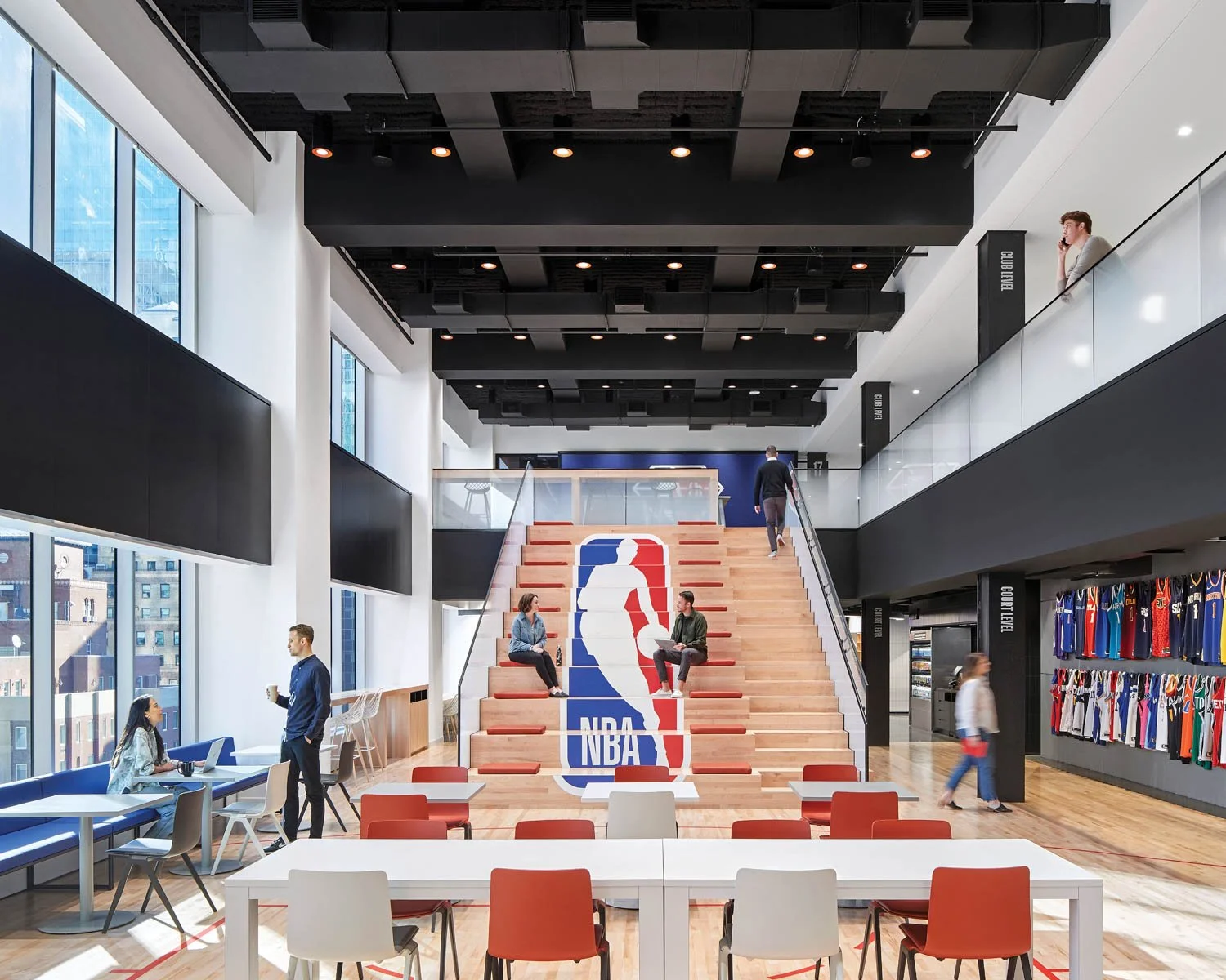
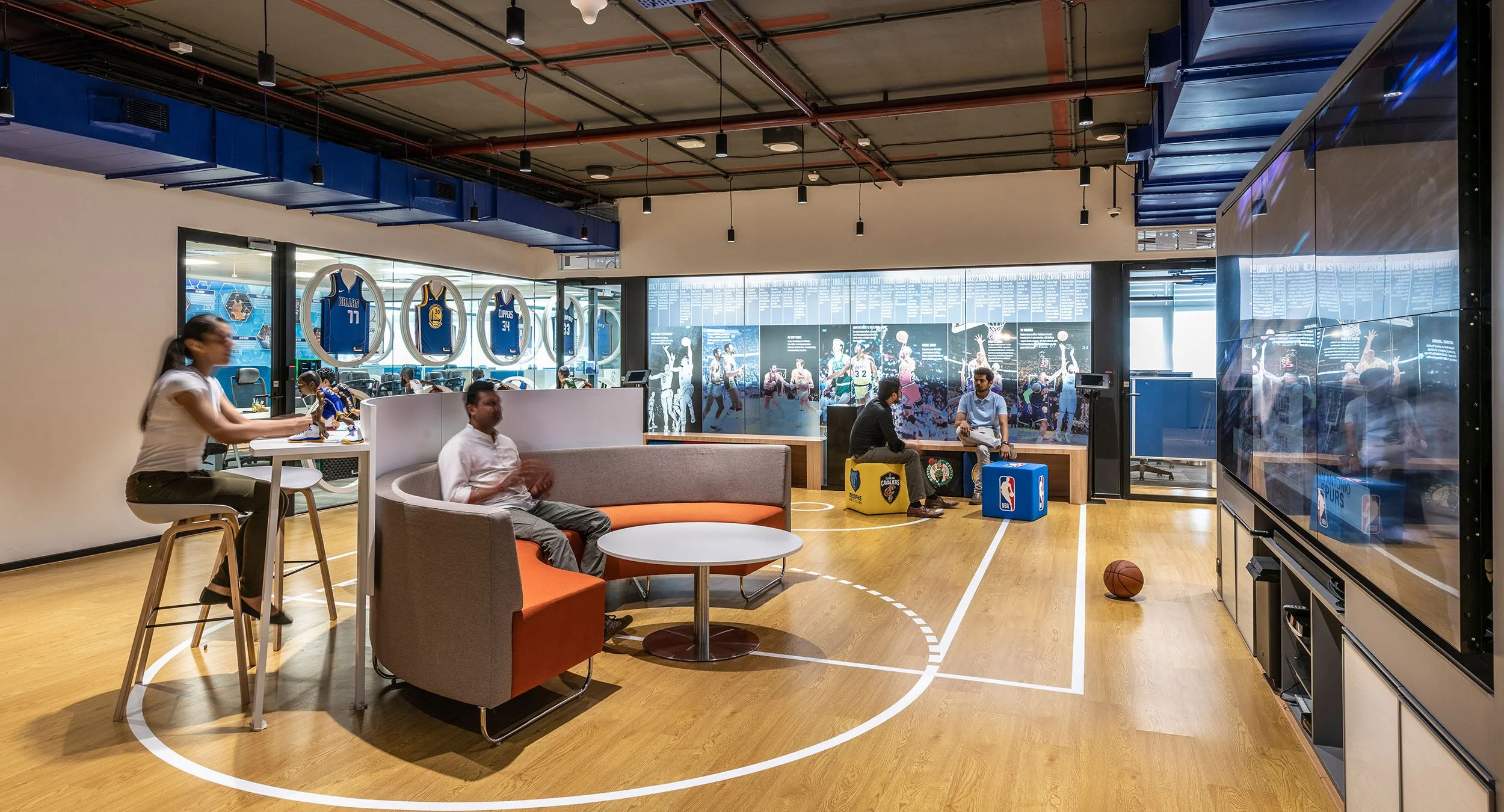
Our process consisted of first looking at what NBA offices look like around the world today. To do this, myself and the interior designer did a deep dive and gathered visual research to help give us an idea of how we could approach the London space. The images below from left to right are snapshots from the NBA offices in Mumbai, Mexico City and New York.
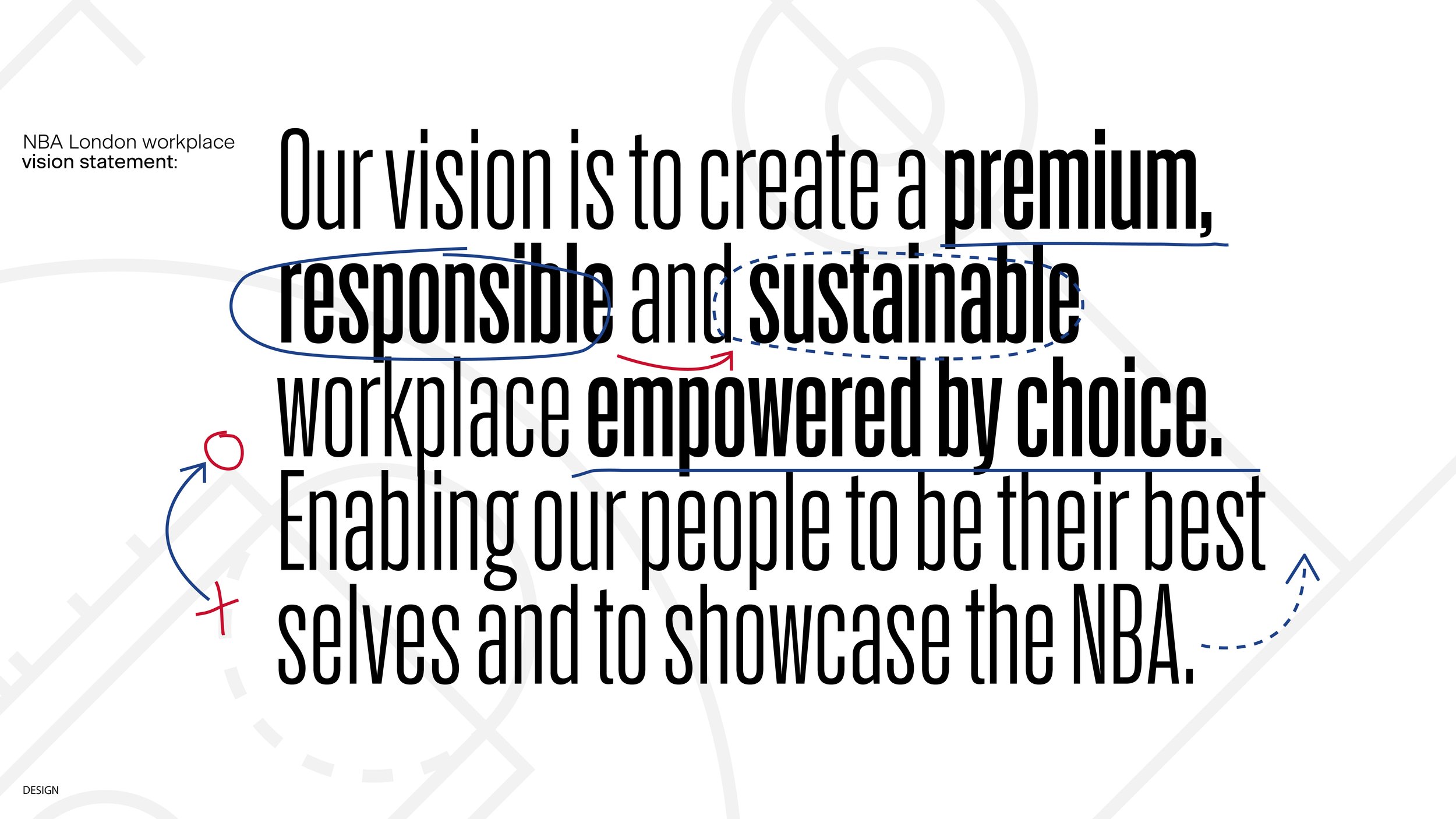
To me, when I think of the NBA I think of the powerful message of connection, inclusivity and history of excellence. However, In order to understand what the NBA means to others, I took the opportunity to gather some feedback and ask members of Thirdway staff what the NBA means to them in one word. We captured a snapshot of those responses below to help inform our design decisions.
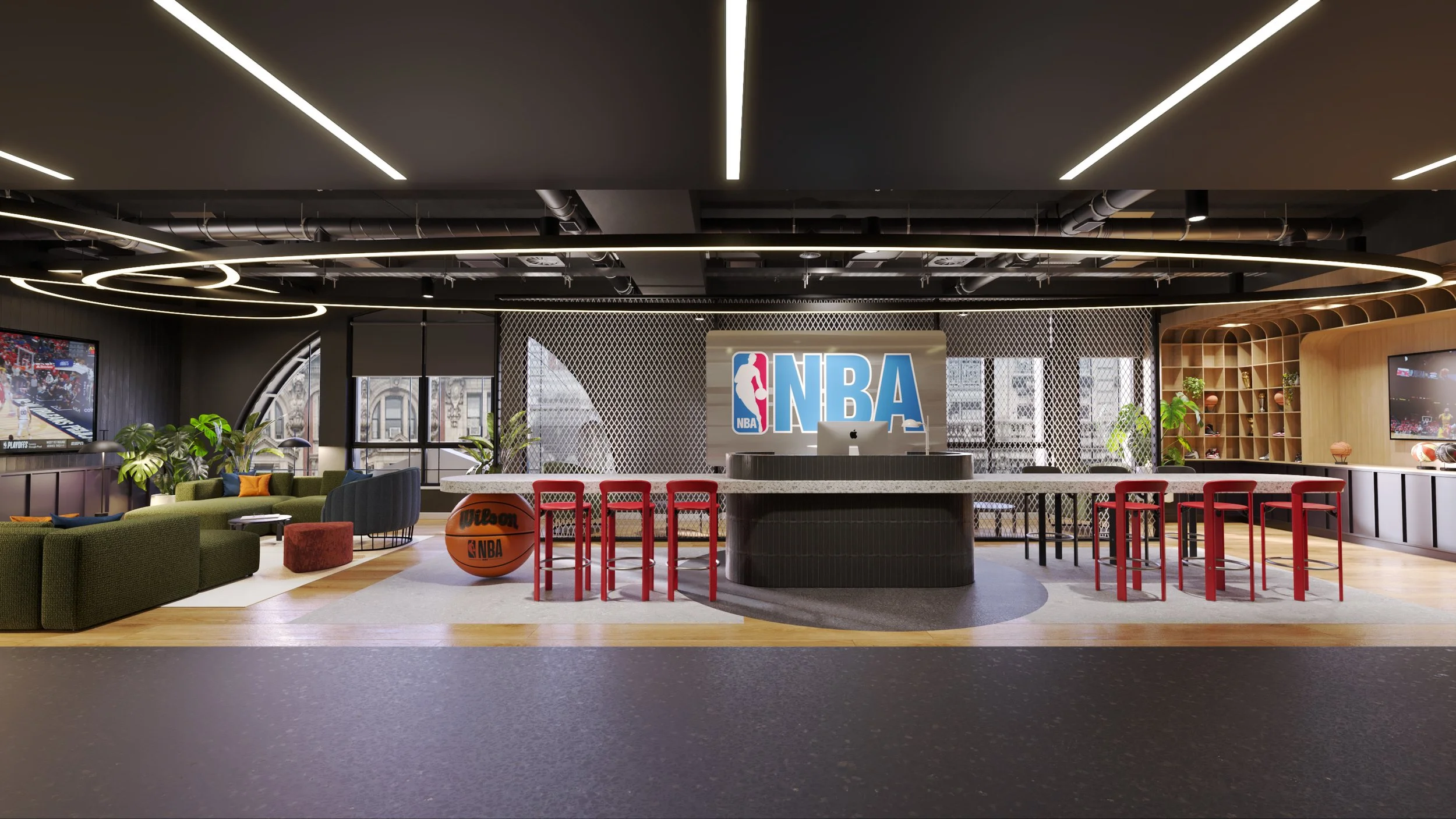
We also paid a visit the NBA flagship store on Oxford Street. The three-floor, nearly 9,000 square foot interactive retail and community space features the most extensive range of officially licensed NBA merchandise. As part of the innovative design, the store features several interactive elements, including LED screens showing NBA highlights, interviews, analysis and social media content as well as measure-ups and handprints of notable NBA players and legends. The store also features a dedicated activation space complete with a 200-inch-wide LED screen and gaming facilities that will host product launches, fan events, special appearances and more.
It was important for us to consider the above when thinking about ways subtly introduce the NBA brand into the space. While the client didn’t want to replicate the layout and design of the flagship stores, there were a lot of visual cues, technology and interactive ideas we could integrate into a working environment.
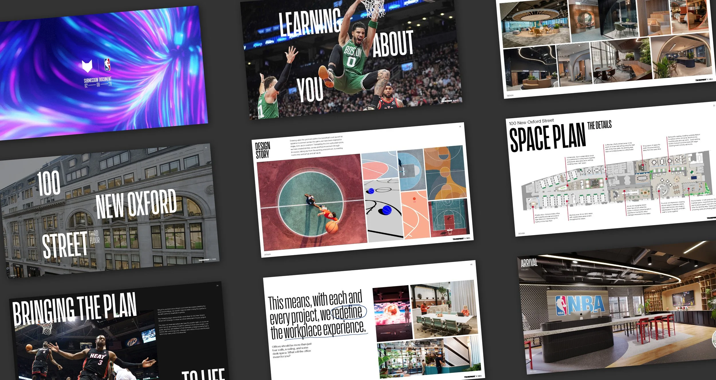
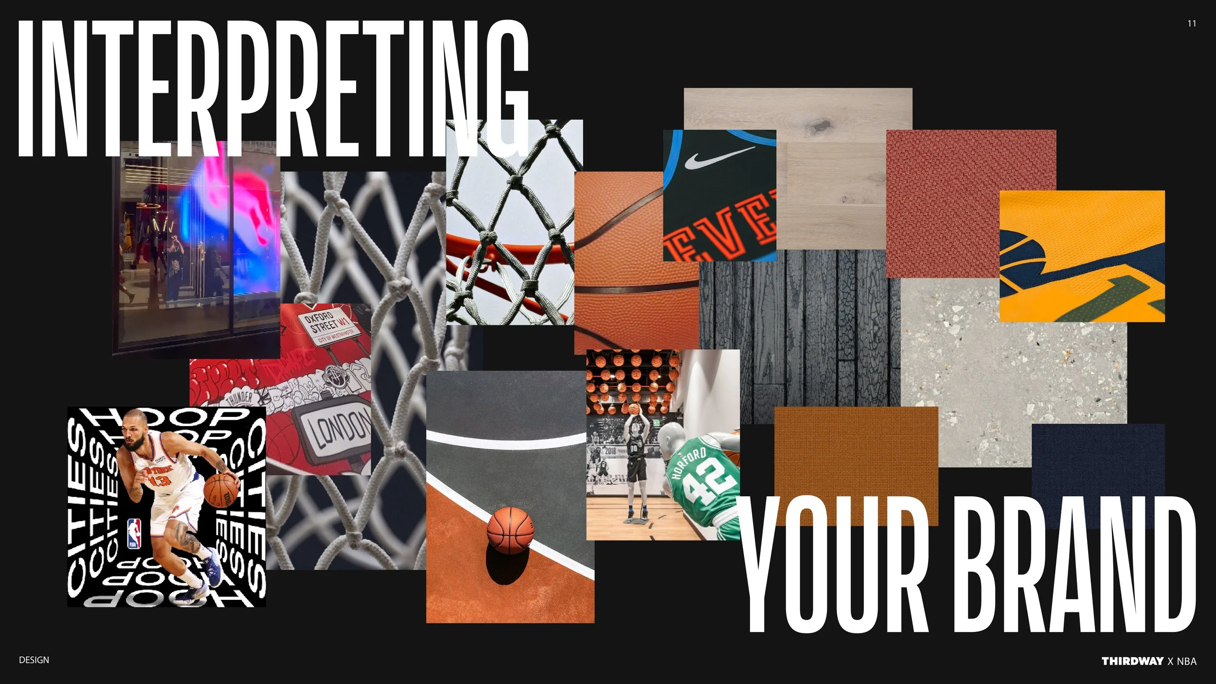
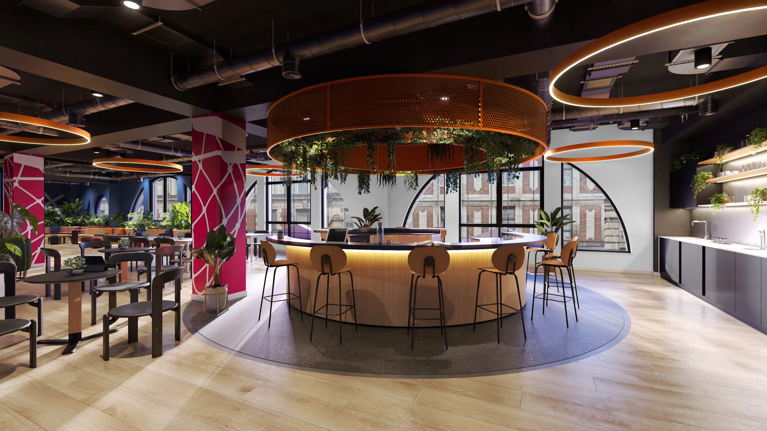
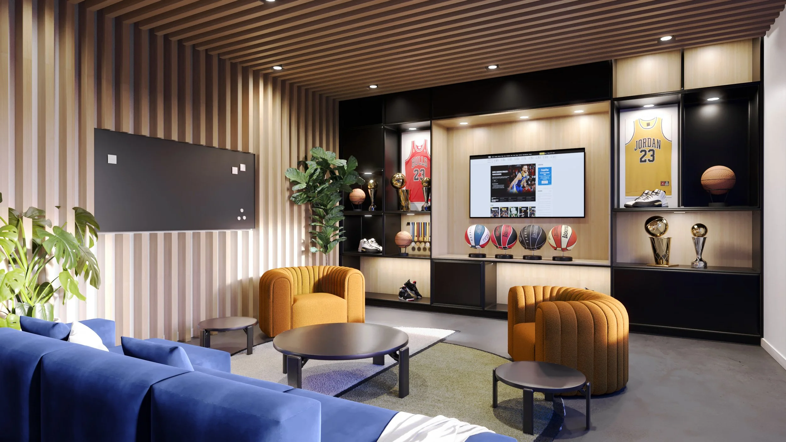
We drew upon the geometry within the basketball court as well as the dynamic movement across the game - inspired by shape, form and movement. To help translate this into a physical space, I suggested the use of arches, curves and fluid movement through the space to mimic the motion of the game.
Below are some of the visuals we worked on to help give the client an idea of our intentions with the space. Through a refined material selection, the colour palette is confident and uninhibited. Using materials in their true form such as, concretes, timbers, rope and terrazzo tiling helps to give the space a timeless backdrop for the NBA story to be told throughout. Along with this, I suggested including some NBA memorabilia and merchandise to display in the arrival area as well as the oversized Wilson Basketball near the reception desk.
With such a historic and culturally significant brand that has touch points across music, film, art and many other forms of popular media, I took the opportunity to delve and lean into this to show the client how much we are not only experts in our field but also fans too! I demonstrated this by using informal basketball terminology, including design hints throughout our proposal and taking elements like the official NBA fonts and colour scheme, weaving them through the document.
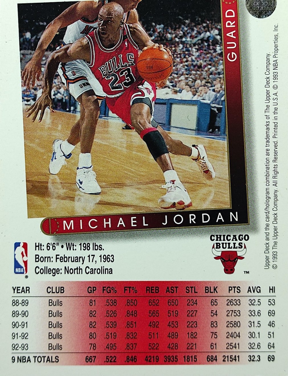
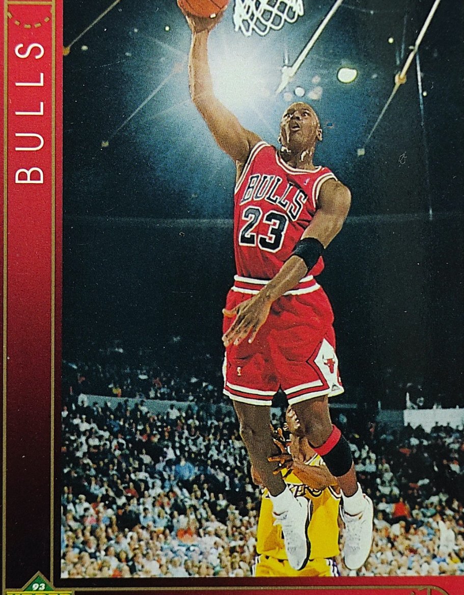
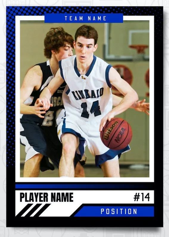
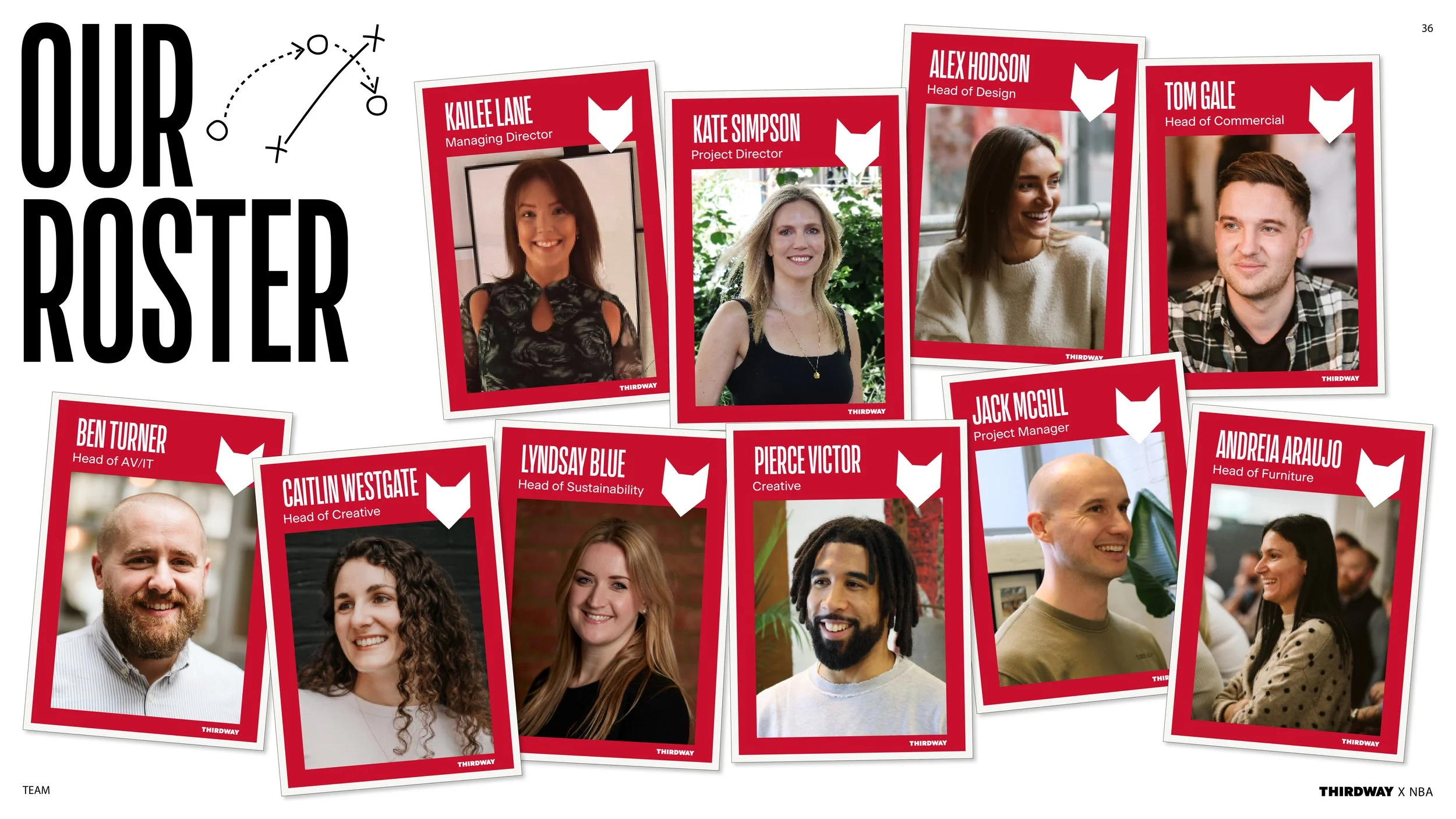
One of my favourite applications was on our ‘team’ page. I spent some time researching into collectable NBA player cards from the 80’s and 90’s. I loved the retro style of these but also thought this could be much more of an interesting way to show the client who was working on the project. The result was a page of fun player card mock ups of the team.